2022 marks the tenth year of this business (and website) as live and screaming, so what better way to celebrate than by blowing a stash on a new rebrand? Actually, not the first rebrand; I like to change my logo as often as my underpants and four changes in the space of a decade is about par for the course. A quick look back then on what’s changed and why for anyone who's interested.

I've always admired clever logos, such as that of Formula 1 as a quick and familiar example. Notice how the F and 1 fit together and how the logo gives the impression of blazing speed and action through the use of the colour red and the lean towards the right. The font's a bit shit, but overall it’s very effective, yet so simple that it looks like someone knocked it up in moments. You know that can’t have been the case though and it probably took months, millions at a brand agency, and many meetings following focus groups browsing alternative options before this won pole position.
Even so, I figured if I ever ran a business, I would take the time to design my own clever and effective logo. Maybe something incorporating the business name with a plugtop or the brown, blue, green/yellow wiring colours? Something that visually said ‘electrician’ without having to physically say it.
In the end however, the logo got knocked up using GIMP on my laptop in about ten minutes flat while the wife watched Coronation Street on the telly one rainy Thursday night in 2012. Next to no thought went into the creation other than the choice of font, Calibri bold/italic, being selected for its accessibility, availability, pleasing curves and friendly appearance. The orange colouring was the only element any prior effort of thought had gone into, chosen because I wanted something vibrant that would stand out.
And so was born the original ‘pumpkin’ logo.

Yeah, okay, so it’s not big, hard or clever and it certainly doesn’t scream ELECTRICIAN, but at the time it was created this website was being bolted together, van branding needed planning and stationery orders for stickers and stuff had to be placed. The nuts and bolts of setting up the business all happened very quickly, even if establishing a reputation didn’t, and I simply ran out of time. One of the first things you need is a name and logo, so if starting a new venture yourself where you want something clever and eyecatching, don your thinking cap early.
While fine for avatars and such, a base logo like the pumpkin doesn’t tell anyone anything about a new startup that nobody knows exists, so it needs to be accompanied by something more explanatory, hence the expansion into the larger form for letterheads, the website title, van signage and such.

It’s pretty inelegant I guess, but it did the job for the first five years. The original domain name used for this site was davidsavery.com which was more spit than swallow, so it got shortened to dses.co.uk almost immediately. In 2014, Nominet opened the .uk top-level domain and I started pushing that as the preference as it has the fewest characters. The van got rebranded in 2016 with the pumpkin and the new domain now in illuminated livery.
One evening in September 2017, I got (uncharacteristically) drunk and decided to prat things around a bit. Actually, the change was precipitated by my getting a replacement van, the new and improved wheelz now itself needing livery. It’s this kind of change in circumstances that tends to prompt a logo rethink, and as I sat once again in front of GIMP with several glasses of wine, I wondered if I really wanted to be blowing a stack of cash in decorating the new van with a logo that was a bit of a mouthful just to look at. Surely simpler is better and less means more? Besides, after five years I had a stable client base and didn’t really need to use the van as a mobile billboard, although in my opinion it’s daft not to. A liveried van is more professional to be turning up in than an anonymous white Transit and it gets you noticed.
So, again, the new logo was knocked up simply and quickly, if not soberly, but it had one job: point people to this website using the short form domain. It doesn’t have to say "Electrician", it just needs to send people this way; the website does the rest. Or, at least, that's the half-cut thought process behind it, but compared to the previous logo, it looked clean, straightforward and the offset characters gave it a certain dynamism that would be lost by centralising the text.

And for two years, all was good in the world. Then, at the end of 2019, we all found ourselves facing a unique, unusual and terrible time to come…
Yes, Brexit. There was that global pandemic too of course, but we were still blissfully unaware of that for the most part at that time. Now, I’m no jingoistic flag-shagger. I’m not particularly patriotic about Blighty, it’s idiotic government or its idiotic business rules that prevent my growing this company. I *could* do more, earn more, employ more and pay more in taxes, but the UK government make it difficult, so why the fuck should I?
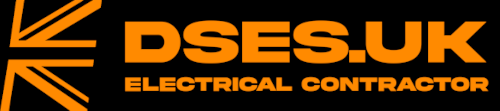
Nonetheless, some articles on this website along with my YouTube shenanigans were attracting international visitors, some of whom were questioning the rubbish I was spouting which differed from their own local rules, regs and standards. The clue’s kinda in the .uk part of the name, but people seemed to be missing it, so sticking a flag into the logo was a visual aid to localise my content and inform at a glance those sifting through the detritus that I speak from a British perspective… well, an English and Welsh one more accurately, some of what I bleat on about doesn’t apply to the likes of Scotland and Northern Ireland, nonetheless a Union flag is more recognisable than the cross of St George, so half a flag got shoehorned into the logo. It coincided with Brexit but isn’t because of Brexit.

And now, two years later, another change in circumstances has prompted another hasty logo rethink as I sit before another episode of Coronation Street, except this time, I admit, I’m more in two minds about it.
I decided to leave the ECA at the end of 2021 which meant expunging their logo from this website, the van, our uniforms and so on. There are costs involved in going to all the effort to change artwork, letterheads, business cards, livery, work shirts and such, but my not paying ECA £700 for 2022 membership covers a lot of expenses, so I figured maybe it’s time to switch things up a notch again. Cue another short spell in front of GIMP with a bottle of cheap plonk which resulted in this.
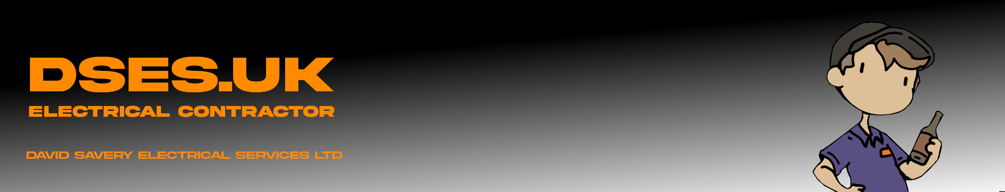
GET IN! Look at the bold capitalisation and bullish heavy lines of that obscure font! It’s a less friendly looking logo; in fact, it looks like it demands to know just what the HELL you’re bally well staring at when you roll your eyeballs over it! I do very much like the orange on black, although orange on white is acceptable for paperwork such as certificates and letterheads according to all the focus groups the wife.
The font is one I’ve had to buy for commercial use and is only good for basic labelling, so Calibri remains the corporate go-to approved for everything else by my... uh... Marcomms department. Is this a better logo than the clean, simple white-on orange-curves of the previous one? I’m honestly not sure. I guess this one says more without saying too much, and I’m happy with how the new work shirts and website rebranding has turned out. Oh, and I can also do cool things with it like this:

Yeah! I feel your envy! I’ve some funky plans for the new van livery too if I can ever iron out the technical details and get it booked in!
Marketing 101 says you should pick a logo and stick with it, but change can freshen things up and draw the attention of those who are so used to seeing something that they no longer notice it. Still, I don’t know if changing from the 2019 logo is the right thing to do.
What the hell, I guess it doesn’t matter much. In twenty years from now, who's going to remember or care about any of this anyway? Oh, but one thing writing this article reminded me of; when I bought my first van ten years ago, an ex-RAC VW eyesore to fit in with my orange colour scheme, I knocked up a spoof proof-of-concept to send to the livery people. Actually, it was just made as a gag for Facebook, but I just remembered it was there. I hope you appreciate I had to log in to a dormant account on that dreadful platform to retrieve this blast from the past purely for your delectation...
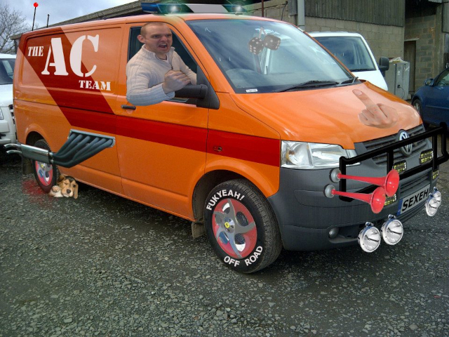
Don't friend request me. Like LinkedIn, it's just a placeholder account. I'm a fucking ghost on there.
AFF4